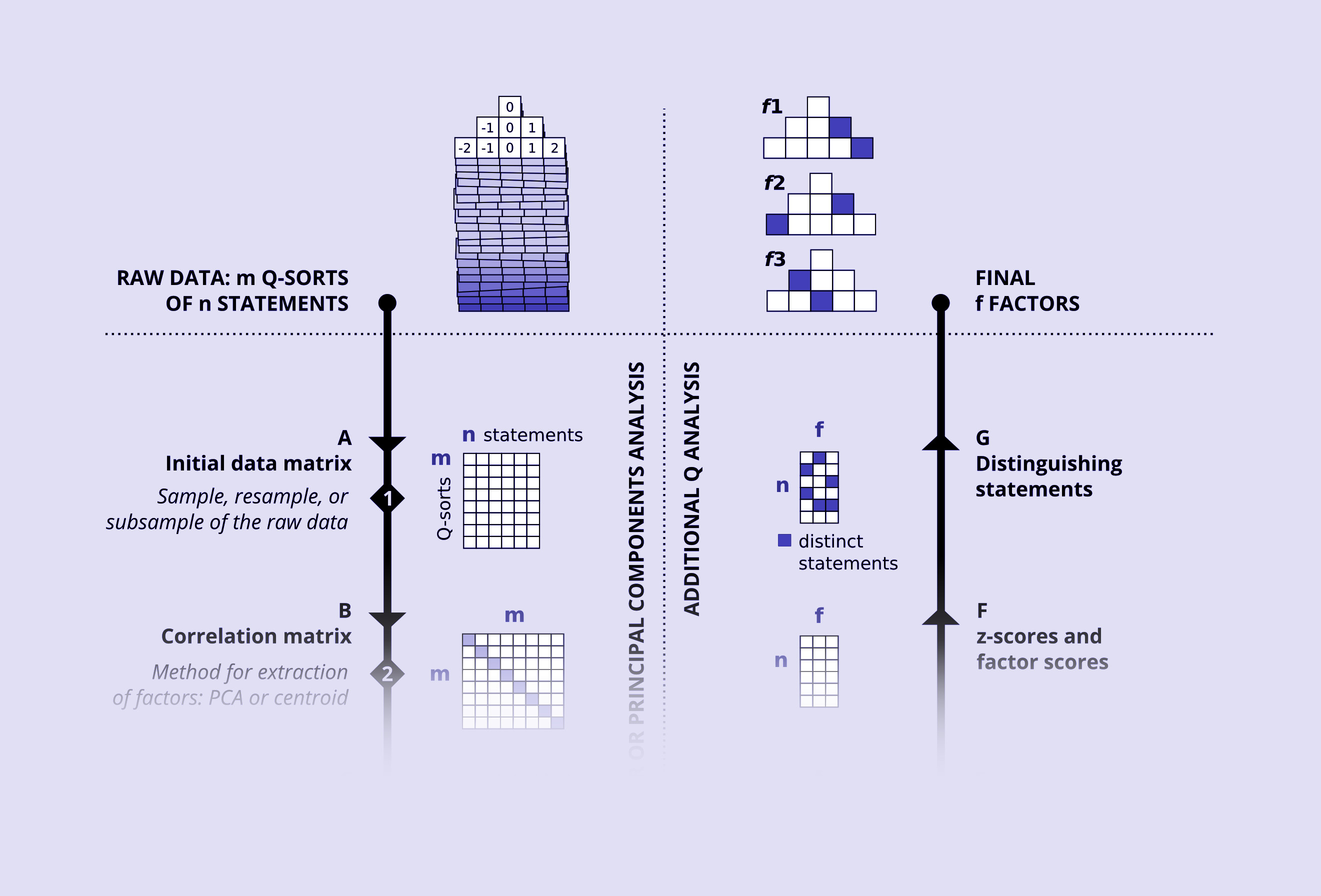
This diagram represents the process of analysis of data of a semi-quantitative method (Q methodology).
The top left represents the raw data, and immediately to the right, one can see how the final results look like (a summary of the raw data in three categories).
The diagram shows each step in the analysis (indicated with letters), each decision made by the researcher (indicated with numbers), and how the data looks like after each step (the matrices).
The full figure is published in PLOS One. See it here. 2015.